Theme Gallery Guide: Install, Edit, and Manage Themes
Manage your store's theme gallery: install new themes, apply or preview them, transfer customisations, and import or export themes between stores.
This component allows you to show all the Page categories that you have created within Pages > All pages, under the list that’s positioned at the left side of the pages table called Categories.
Next, you can find the list of options that will allow you to customize it:
This allows you to choose how categories will be displayed on the component, based on the following options:
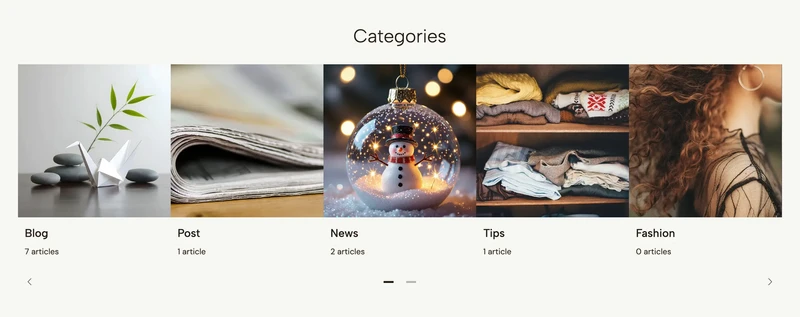
Carousel
Categories will be displayed within a Carousel section.

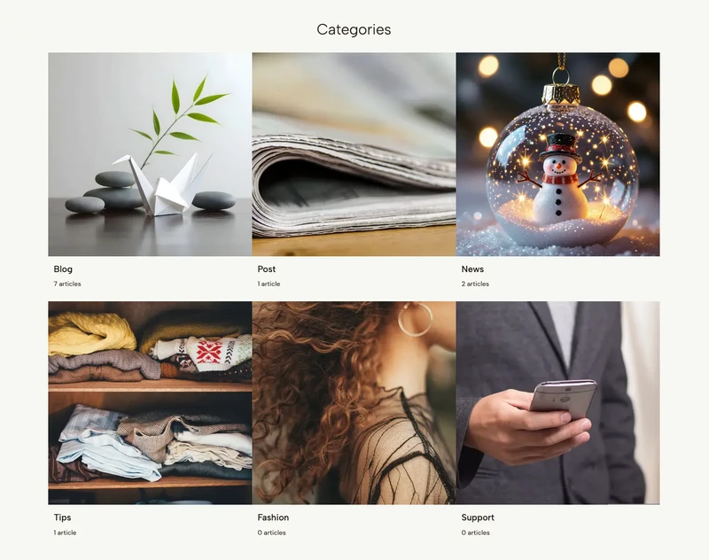
Grid
Categories will be displayed within a Grid system.

Tag cloud
Categories will be presented as buttons, which will include the amount of articles they have inside a bagde element at the right side of the name.

Note: For Carousel and Grid options the image of each category will be displayed. For the case of Tag cloud, the image will not be considered nor displayed.
You will find two options to define the amount of columns in which categories will be displayed, for desktop and mobile devices.
Note: these two options won’t be available (they will hide) when you choose
Tag cloudwithin theDisplayoption.
This group of options will become visible when you choose Carousel, and they will allow you to customize its behavior.
You can find the full list of options on this page.
Note: these group will only be available if you choose
Carouselwithin theDisplayoption.
By enabling this, a Heading section will be displayed before the component’s content. You can find the list of options on this page.
This group of options allows you to customize certain design aspects about the categories blocks.
Show amount of articles
Allows to define if the number/amount of articles within each category should be displayed, for any case of the Display option.
In the cases of Carousel and Grid, the word article(s) will be next to the number.
For the case of Tag cloud it will only display the number.
External link
Allows to open each link to a category on a new browser tab.
Alignment
You will find two options to define the content alignment (category name and amount) for both desktop and mobile devices.
Image ratio
Allows to define the dimension to which category images will adapt to.
Note:
AlignmentandImage ratiooptions will only be visible for Carousel or Grid within theDisplayoption.
This group allows you to customize styles of the title (category name) for all blocks, like for example the weight.
Note: these group will only be available if you choose
CarouselorGridwithin theDisplayoption.
This group contains the following options to customize the component:
The Customize options allows to adjust the animations for this specific component. You can read which ones are available on this page.
Start your free 7-day trial. No credit card required.