Theme Gallery Guide: Install, Edit, and Manage Themes
Manage your store's theme gallery: install new themes, apply or preview them, transfer customisations, and import or export themes between stores.
We recommend that you also visit the article about how components within our themes work.
This section which can be accessed on the top left sidebar panel of the Visual Editor contains several options for you to customize your theme, with sub-sections such as Design, Colors, Fonts, among several others.
Many of the options inside apply generally to components and subcomponents of the theme, and for some cases they can be overriden through additional options within them.
Next we detail all these sections, what they do and what you can achieve.
This section contains what we call Color Packs, which are groups of colors related and applied to multiple elements within the theme.
Next, we detail some aspects of them so you can know how to make the most out of this feature.
The theme comes with 3 pre-installed packs, that are applied across the multiple components available for you to use.
Content
The first one is called Content and it’s used -almost- on all components within the theme by default.
Therefore, if for example you wish to change the design of your store to have a very “dark look”, this is the pack you would need to modify and adapt colors in, so it applies across all sections.
Dark
This pack is used mainly on subcomponents of the theme such as the following:
Slide → subcomponent of Top Bar
Slide → subcomponent of Slider
Banner → subcomponent of Banners
Big BannerIts main purpose within the theme is to provide a “dark” style, with its respective content contrast colors, which is the case for subcomponents such an Slide where there’s an image that acts as the background, with content on top of it.
Light
This pack it’s used for example in the Footer component of some themes and it’s also applied by default on the following components and/or sections:
NewsletterProduct ReviewsBreadcrumbsWithin each Color Pack you will find the following options:
Suggested Colors
Also within each Color Pack, after all the their options, you will find a section with multiple predefined sets of colors that you can use, which we had manually created based on good use of color contrast and known standard practices within the E-commerce ecosystem.
Inside this group you will find other colors that are applied to different wishlist elements:
Inside this group you will find other colors that are applied to different elements across the theme:
Note: The Product Reviews feature on Jumpseller it’s only available for Pro plans and above. For more information about this feature, you can visit the following article.
This section allows you to customize the fonts of the theme, that’s connected to the Google Fonts library and will allow you to have access to the entire set of more than 1.700 fonts.
Next, we explain in detail how each option is applied within the theme.
Within this group you will be able to define the fonts for several general elements within the theme:
Main
This font is applied to all Titles within the theme. Examples of this are:
Slide, Banner, Featured products, Template heading, Testimonials, Media with text, etc.Product title subcomponent.Secondary
This font is applied to all the remaining texts across the theme. Examples of this are:
Header, Desktop menu and Mobile menu.Slide and/or Banner subcomponent.Media with text component.Featured products, Latest products, among others.Store name
This font is applied to all places where the Store name is displayed, which will be visible if you haven’t uploaded a Logo either through the available options on the Header and Footer components or on your store’s admin panel at Settings > General > Branding.
Sections where the store’s name will appear are the following:
Branding section or within the Shopping process section.Buttons font
This font it’s applied to all buttons across the theme.
Font base size
This option allows you to define and modify the “general” font size of the theme.
Themes are designed using scalable units, meaning that once you increase or decrease the amount of pixels on this option, several elements will immediately be affected by it.
This section allows you to modify and adjust several design settings of the theme.
Custom name
This option allows you to define and display a different name than the one defined within the store’s admin panel at Settings > General > Preferences > Store Name.
So, for example if you haven’t uploaded a Logo in any of the instances described before, what you add on this field will be displayed on all those sections.
Size
This option allows you to define the size for the Store name, which will be applied on all sections where it’s displayed.
Note: the size will be applied to the name added within this field or to the one within
Settings > General > Preferences > Store Name.
Weight
This option allows you to modify and adjust the weight of the Store name.
Note: The weight will depend on the available variables of the font that you have defined for the Store name option, within
Theme settings > Fonts.
Maximum container width
This option allows you to define the maximum width that the container of the theme will have.
The container is a section that wraps all the content from a page and/or component, and determines how the elements that are inside are gonna be displayed and arranged.
By changing the width of it, the dimensions of elements such as for example images will vary, which will have an effect on the -optimal- sizes that you will need to upload.
The available sizes for this option are the following:
All Components within the theme will be affected by what you choose here, but you will find some with its own Width configuration, which upon theme installation come with a Default option selected, in which case it will respect initially the value selected in here. You can change the Width option on them to make them behave differently.
Spacing
This option allows to define if components and their content will show a space or separation between them, or if you don’t want them to have any.
This will affect for example the right and left space between the component’s content and the browser’s sides.
Also, some blocks will also behave differently based on what you choose here. For example, if you define None, Banners, Products, etc., will look and appear very close together, allowing you to generate a different type of design.
Rounded corners
This option allows you to define if sections and elements will have rounded corners or not.
Examples of how this is applied can be noticed in:
Font size
You will find two options to define the size of the text for mainly all buttons within the theme, for both desktop and mobile devices.
Style
This option allows you to modify the style for the majority of the buttons within the theme.
Text format
This option allows you to define how the text for all buttons on the theme will be displayed, based on the following:
Transition
This option allow to enable a transition for all theme’s buttons, which will make visible new options to customize this:
This group of options allows you to customize the design and appearance of lines within the theme. These can be found for example in the following sections and/or components:
The options for you to customize these elements are the following:
Style
Allows to define the style for all lines, borders and separators within the theme.
Thickness
Allows to determine the thickness for all lines and borders within the theme:
1px.2px.This group of option allows you to define the style for the navigational elements of a Carousel all across the theme.
Theme dots style
Allows to define the style for the “navigational dots” (or markers) with which users can navigate and control a Carousel within the theme.
Arrows and dots size
Allows to define the size for the arrows and navigational dots (or markers) for all Carousels within the theme.
The icons used within Jumpseller themes from version 4.0.0 and above are from the Phosphor Icons library, which has more than 9.000 icons to choose from.
This group of options will allow you to control and define how they look and how they are applied within the theme.
Style
This option will allow you to define the style for mostly all icons used in the theme. Available styles are the following:
Cart icon
This option allows you to define the “Cart” icon that will be used across the theme. The sections in which this icon can be visible are the following:
Show Cart icon in buttons
As it was mentioned above, this option allows you to display the Cart icon in the Add to cart buttons within product blocks and product pages.
This group of option allows you to enable an animation for most -if not all- sections and components within the theme, in order to provide movement to the design of your store and make it more appealing for your customers.
Enable animations
When enabling this, the following options will become available for you to customize them:
Also, you will find an option within components called Customize options, most likely inside the Appearance group, with which you will be able to customize the transitions specifically for them and they will override the ones within this section.
Note: If you disable the option
Enable theme animations, it will affect all components within the theme. Therefore, even when in one or more components you have enabled theCustomize animation optionsoption, animations won’t have an effect at all, as the option here in Theme settings controls all of them.
Note: This feature is only available for stores subscribed to the Pro plan and above. For more information you can visit the following article.
By checking the Enable Wishlist option, the Wishlist feature will be enabled across the entire theme.
When doing so, the Show on group of options will become available to be used, so you can define in which sections it will be displayed:
Header
Displays the Wishlist’s links on the theme Header, so users can navigate directly to the respective section on their Customer account page.
Product blocks
Displays the Wishlist icon on product blocks. This will give users the ability to quickly add products to their Wishlist, without necessarily having to access the page of any of them.
Product page
Displays the Wishlist button (icon and text) on the product page.
This is part of the Wishlist subcomponent, which it’s a child of the Product template component, located on the Product layout of the theme.
Note: Users will be able to Wishlist a product only once they are logged in.
You can read more about it on this article.

The Breadcrumbs is the section that can be displayed at the start of layouts like for example Categories, Products, Pages and Contact page.
It allow users to know the path they have followed to reach a certain page. The options for you to customize it are the following:
Show on
This option allows you to define in which instances this section will be displayed:
Alignment
You will find two options to define the alignment of the list for desktop and mobile devices.
Margins
You will find two options to define the inner upper and lower margin (space) of the section.
Content colors
Allows to choose the Color Pack for the Breadcrumbs.

The Heading is a section displayed in mostly all components within the theme, and it’s composed commonly by the following elements:
The options within this section of the Theme settings will affect all places where a Heading is present or available to be displayed:
You will find two options to define the alignment of the list for desktop and mobile devices.
This group of options allows you to define the design and appearance of the titles for all Heading sections within the theme:
Size
Defines the size for all titles within the Headings of the theme, based on pre-defined calculations directly affected by the Font base size option located at Theme settings > Fonts > Sizes.
When choosing Custom, you will be able to manually adjust the size for desktop and mobile devices independently.
Weight
Defines the weight for all titles within the Headings of the theme.
Note: The weight will depend on the available variables of the font that you have defined for the Main font option within
Theme settings > Fonts > Font selection.
Letter spacing
Allows to adjust the space between letters.
All caps
Allows to force all Heading’s titles to be displayed in uppercase letters, even when they weren’t written like that: e.g. TITLE.
Show line below
Displays a line or border below the titles, in order to generate a more clear division with the content that comes below.
This group of options provide the same design choices than the Titles.
The difference here is that the options to define the size of them will only be displayed if you choose Custom on the size option for Titles.
When doing so, two options to define the size for desktop and mobile devices will show. For any other option different than Custom, subtitles will be calculated based on percentages related to the size of titles, as follows:
Here you will only find the option to control the Size of the descriptions, which also displays options to control it on desktop and mobile devices by choosing Custom.
Aspects such as the weight and uppercase, can be added and adjusted through the respective fields in which you can add a description on a Heading section.
Note: The size for descriptions will also be directly affected by the Font base size defined at
Theme settings > Fonts > Sizes.
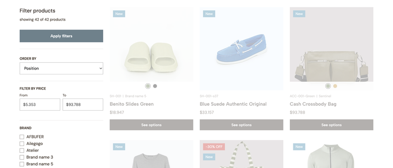
This section provides several options for you to customize and define how Filters work within the theme.
To know more about how filters work in Jumpseller, please visit this link.
Note: The Filters feature it’s only available for Premium plans or above.
Show on desktop
Defines if the list of filters should be displayed at the left side of the Product feed subcomponent, which is available to be used at the Category and Search results layouts, like it can be seen on the image at the start of this section.
This will only be reflected on Desktop devices that have a width equal or greater than 768px.
For devices that have a width equal or lower than 767px, filters will be available within a lateral panel, which can be opened through a button that will be displayed within the Heading section.
Note: If this option is disabled, the behavior would be the same as the one on Mobile devices.
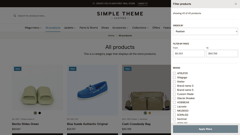
Example of the Filters sidebar panel opened on a Desktop device, when it has been disabled to be displayed next to the Product feed.
Apply filters on click
This option will show when the previous one is enabled and allows to apply filters instantly when users click on them. Therefore, the page will automatically be reloaded.
By enabling this, there will be certain aspects that will change within the page that you need to know:
Filter by price sub-section shows, which will only work for these ones.Note: what’s mentioned on the list above will only occur on Desktop devices. For Mobile devices the functionality of the filters will remain the same, by having to click on the Apply filters button within the lateral panel.
Within this group you will find options to show or hide different types of filters.
Show ‘Order by’ filter
This option allows you to show or hide the selector with which clients can re-order the list of products, based on the following:
Note: for categories, you can choose the default option of this selector by going to the
Propertiessection, inside their respective settings onProducts > Categories.
Show subcategories
Defines if the subcategories (inner levels) of a category will be displayed along with the rest of the filters.
Note: This will only be reflected on Category layouts.
Show filter by price
Allows to show or not the fields with which clients can filter products based on a minimum and maximum price range.
The possible price ranges will be determined based on the collection of products listed within a Category and/or Search results layout.
Show filters counter
Allows to display the amount of products of each filter within parenthesis, e.g. Red (2).
Limit amount of filters items
This option allows you to limit the amount of items within all filters groups.
This is useful if the list within your filters it’s too long and you want to show just some of their items first.
When enabling this option a + Show more link will display at the end of each filter group.
Upon click, the group will expand showing all the remaining items, and the link text will change to - Show less. On a second click, the group will shrink back again and hide the items.
Note: this won’t affect the
Order byfilter.
Amount of visible items
When enabling the previous option, this one will appear.
It allows to define the initial amount of filters items to show within the groups.
So for example, if one of your filters has a total of 12 items, and within this option you define 5, the remaining 7 items will be hidden until the user clicks on the + Show more link.
Enable collapsible filters
This option makes that the entire list of filters to work as an Accordion, making them collapsible, and allowing them to be opened upon click.
By enabling it, a new option will show called Default collapsible display, which will have the following two options:
A Product block is the preview “block” -or also refered to as “card”- of a product that can be displayed in multiple layouts of your theme. It contains several information about each product, for clients to know details about them -hence, preview them-.
Next, we explain all the possible options for you to customize them.
Within this group you fill find options to customize the general design and look of all product blocks within the theme and across the different sections and components that display them.
Content order
Defines the order of the elements that display within the content area, which is the one that goes just below or after the product image.
Here you can reorder the options by dragging them up and down, to define the position that feels better for you.
Some things to consider are:
SKU and/or Brand defined, and if both are enabled within the Information group that can be found further down.Disable product prices is unckeched.color.Products per row on desktop
Defines the amount of products per horizontal row that will be displayed for Desktop devices.
The way in which this affects products, will be based on the details from the following table:
| Option value | Device width | Products per row |
|---|---|---|
| 5 | ≥ 1200px | 5 |
| 5 | ≥ 991px | 4 |
| 5 | ≥ 768px | 3 |
| 5 | ≥ 576px | 2 |
| 4 | ≥ 1200px | 4 |
| 4 | ≥ 991px | 4 |
| 4 | ≥ 768px | 3 |
| 4 | ≥ 576px | 2 |
| 3 | ≥ 576px | 3 |
Products per row on mobile
Defines the amount of products per horizontal that will be displayed for Mobile devices with a width equal or lower than 575px.
Note: when choosing 2 products, the size of content elements such as name, price, etc., will slightly decrease to preserve the design of the information on smaller mobile devices.
Content alignment
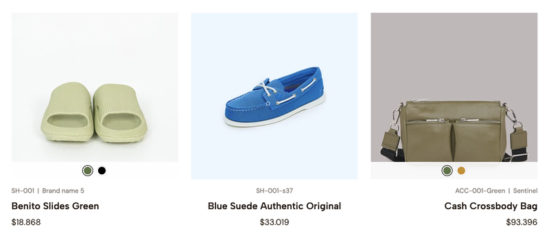
Example of different alignments: Left, Center and Right respectively
Defines the alignment for all elements within the content area of blocks.
Space between
Allows to define if product blocks will have a space or gap between them.
The amount of space will be determined based on what you choose within Theme settings > Design > Theme styles > Spacing.
Note: This option won’t be visible if
Spacingit’s equal toNone.
Rounded corners
Allows to define if product blocks will have rounded corners or not. The way in which this is applied will vary based on:
Card style for product blocks is enabled, the corners will apply to the entire block. Image padding option is disabled the image will also present rounded corners.Card style is disabled, corners will only be applied to the image.Enable Quick view
Allows to enable the Quick View feature, which is explained in this section.
By enabling this, an icon will be displayed on the product blocks image area, which will be revealed when users “hover over it on desktop devices. For mobile devices, it will always be visible.
This group provides options to customize how the name of products look within blocks.
Size
When choosing Base size, the size of the name will be determined by what’s defined on the Font base size option.
When choosing Custom, you will be able to manually adjust the size for desktop and mobile devices, respectively.
Weight
Allows to adjust the weight of the product name within blocks.
Note: The weight will depend on the available variables of the font that you have defined for the Main font option within
Theme settings > Fonts > Font selection.
Letter spacing
Allows to adjust the space between letters for all product block names.
All caps
Allows to force all product block names to be displayed in uppercase letters, even when they weren’t written like that: e.g. PRODUCT NAME.
Dimension
Defines the dimension for all product block images across the theme. The available options are defined based on aspect ratios, which are exemplified below:
| Option | Aspect ratio | Example of image in pixels |
|---|---|---|
| Landscape | 16:9 | 527 x 296 |
| Portrait | 3:4 | 527 x 702 |
| Rectangular | 4:3 | 527 x 395 |
| Square | 1:1 | 527 x 527 |
Display
Defines how the product images will adapt to the available space related to the dimension selected above.
Transition
Allows to define if a transition will be applied to the product block image, when users hover (mouseover) over them:
hover.hover.hover state.Note: Show second image will only work if the product has at least 2 images added. If not, when a user hovers on a product there will be no transition at all.
The following group of options allows you to define which product details will be displayed in the content area of blocks.
SKU
Displays the SKU of products. It won’t be displayed if the SKU field is empty within a product configuration.
Brand
Displays the Brand of products. It won’t be displayed if the Brand field is empty within a product configuration.
Note: The order for these two attributes will be first
SKUand thenBrand, and they will be separated by a vertical line. This line won’t show if a product doesn’t have one of the two.
Ratings
Displays the rating stars and rating average score for products that have customer reviews.
Note: The Product Reviews feature on Jumpseller it’s only available for Pro plans and above. For more information about this feature, you can visit the following article.
Color options
Displays the first option of type Color along with its variants.
Note: If a product has 2 or more options of type
Color, only the first one from the list of options will be displayed.
When enabling this a secondry group of options called Colors styles will show with the following options inside of it:
This group of options includes one option called Show 'Add to cart' button, that when enabled will display the button to add products to the cart from any page of the store, without the need to access their individual pages (product page) to do so.
Products will be able to be added to the cart as long as they:
Not available or Out of stock.Also, a set of additional options will become visible for you to customize this section further:
Show Quantity selector
Displays the selector (or field) with which clients can choose the units they want to add to the cart for any given product.
Show status buttons
Displays a button for products that have a status of Not available or Out of stock at the bottom part of the block, which also takes to the respective product page.
Show ‘Buy now’ link
Displays a Buy now link below the Add to cart button.
This option it’s useful to streamline the purchasing process, allowing users to quickly complete their purchase with minimal steps, enhancing the experience and potentially increasing conversions.
This link works differently than the button, as it has its own funcionality which is explained next:
Settings > Checkout > Preferences > After adding a product to the cart.Show ‘Add to cart’ button on hover
This option allows to show the Add to cart button, along with the other elements that can be enabled, only when users “hover” over the product block.
Note: This will only be applied on Desktop devices. On Mobile devices, the button will always be visible.
This group of options allows you to define how prices will be presented on product blocks.
Alignment
Defines how prices will be displayed within blocks based on the following conditions:
Range option has been defined.The available options are the following:
Show ‘from/until’ text for variants
Displays a text before prices when a product has variants (e.g. Color, Size), like for example: from $200.
Variants price display
Defines how prices will be displayed for products that have variants and when these variants have different prices.
Price alignment option mentioned above.Show tax indicator
Displays a text next to the price indicating that the final price is “plus tax”. If the checkout tax settings indicate that the products already include tax, this text will not be displayed.
When enabled, the following options will become visible too:
Variants price display it’s equal to Range, the label will be displayed only for the higher price.The options within this group allow you to define how labels within product blocks will be presented. This will only apply for the following ones:
Options are the following:
Size
When choosing Base size, the size of the labels text will be determined by what’s defined on the Font base size option.
When choosing Custom, you will be able to manually adjust the size for desktop and mobile devices, respectively.
Position
It allows you to define where product labels will be positioned over the image. The labels that this option considers are:
Shape
Defines the shape that labels will be presented with.
This group of options allows to define how the Discount label will be presented, which will only display in the following cases:
Code. In case it is, the label will show if the client has entered the code at the cart page.Display
Defines the way in which the label will be presented, as follows:
If you wish to change the text of this label, you can do so on the Theme translations group, on the Discount label text field.
Note: This text will also be applied for the label that can be displayed within product pages, next to the price. If you don’t want to display a text, just leave the field empty.
Shape
Defines the shape that this label will have on product blocks.
When checking the Show option, two options to define the background and text color will be available.
This label will display for products that have a status of Not available or Out of stock.
This group of options allow you to customize a label for products considered as “new”.
When enabling the Show option, the following ones will become available:
Threshold
Defines the amount of days at which a product will be considered as “new”.
Colors
You will find two options to define the background and text color of the label.
By enabling Card style all product blocks within the theme will be presented with a “card” or “box” style. Also, the following options will become available:
Shadow on hover
Applies a shadow at the back of the blocks when hovering on them.
Image padding
Creates a separation between the edge of the block’s background and the image.
Border
Displays a border on all sides of the block, to create a more visible difference between products, as well as with the content around them.
Border opacity
Allows to adjust the opacity (transparency) of the border, if enabled.
Content colors
Allows to choose the Color Pack for all product blocks.
This group of options apply for the Quick View and Wishlist buttons that can be enabled within product blocks.
Font size
Allows to define the size of the buttons, with the following optinons:
Theme settings > Fonts > Sizes.This feature lets your customers preview product details without leaving the page they’re at, making the browsing experience faster and easier.
It will work and be visible as long as:
Enable Quick view option is enabled at the Product block settings.Enable Quick view option is enabled on the Product mapping component settings.The option to customize how this will look and behave are the following.
Display
Defines how and where the product details will be displayed, based on the following options:
Show SKU
Displays the SKU of the product. It won’t be displayed if the SKU field is empty within a product configuration.
Show Brand
Displays the Brand of the product. It won’t be displayed if the Brand field is empty within a product configuration.
Note: The order for these two attributes will be first
SKUand thenBrand, and they will be separated by a vertical line. This line won’t show if a product doesn’t have one of the two.
Show reviews
Displays the rating stars and rating average score for products that have customer reviews.
Note: The Product Reviews feature on Jumpseller it’s only available for Pro plans and above. For more information about this feature, you can visit the following article.
Show stock
Displays the stock availability or status that a product has.
Show wishlist button
Displays the Wishlist feature. You can read more about it in this section.
Note: This feature is only available for stores subscribed to the Pro plan and above. For more information you can visit the following article.
Show description
Displays the product description with all its content.
Button text
Text that displays on the button that opens the Wishlist. This text won’t be presented next to the icon, but it’s useful for the browser and assistive technologies.
Content colors
Allows to choose a Color Pack for for the Quick View.
The options in this section apply mostly to the Product form subcomponent that’s available within the Product template and Single product components of the theme.
It also applies to the Quick View feature, for either of its Display options.
Quantity selector
If enabled, the product quantity selector will be visible along with the form buttons.
‘Buy now’ button
Displays a Buy now button next to the Add to cart one, within the product form.
This option it’s very useful to streamline the purchasing process, allowing users to quickly complete their purchase with minimal steps, enhancing the experience and potentially increasing conversions.
It works differently than the Add to cart one, as it has its own funcionality which is explained next:
Settings > Checkout > Preferences > After adding a product to the cart.By enabling this option, the following ones will become available:
Add to cart, therefore, styles will switch between both.Buy now button when the action is not possible to perform, like for example when a product has variants and one of them is Out of stock.This group of options allow to control aspects related to product options and their variants within the form.
Start on first gallery image
If enabled, the product gallery will start on the first image instead of the image associated with the first or selected product variant.
Options display
Defines how product variants of a Product option of type option will be displayed:
Buttons: Variants will be displayed with a “button” or “pill” style. The style will vary depending on the status of each variant:
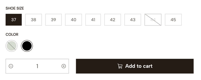
Select
Variants will be displayed within a list selector.
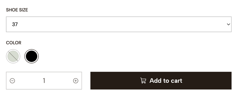
Note: Options of type Color will always be displayed with “button” style.
Available tag for Product stock
This option is related with the Stock subcomponent that’s available within the Product template and Single product components.
Allows you to show or hide the label that can be displayed mentioning the “availability” of a product. The text in it will be as follows:
Exact stock amount
Changes the behavior of the Stock label mentioned above and instead of a text, the stock amount for the variant will be displayed, like for example: 10 units in stock.
Note: For variants where Unlimited stock is enabled, it will always show the text “Available in stock”.
Hide variants without stock
Hides all the variants that don’t have stock, from the list of product options on the theme, therefore, they will not be able to be selected by users.
Hide locations without stock
Hides all Locations that don’t have stock, which are visible within the Stock locations panel that’s displayed when clicking on its respective button.
Note: For more information about the Stock Locations feature, you can read the following article.
Low stock message style
This option allows to define the style of the message that is related to the Low Stock Thresholds admin option for products, which you can read more about on this article.
Contact button
Displays a button that takes to the Contact page of the store, within the message that show for products with Out of stock or Not available statuses.
WhatsApp button
Displays a button that takes to the WhatsApp app on mobile devices and to WhatsApp web on desktop.
This button displays within the message that show for products with Out of stock or Not available statuses as well.
Note: The WhatsApp number connected to this button will be the one added in your store’s admin panel, within
Settings > General > Preferences > Social media.
Show tax indicator
Displays a text next to the price indicating that the final amount considers tax.
If the checkout tax settings indicate that the products already include tax, this text will not be displayed.
When enabled, the Indicator in all caps option will show allowing you to force the text to be displayed in uppercase text, e.g. + TAX.
Show price without tax
Allows to show the product price without including taxes.
The following options will only work for products of type Appointment.
Show duration
Displays the Duration details defined at the appointment settings, before the calendar.
Show location
Displays the Location details defined at the appointment settings, before the calendar and after the Duration (if enabled).
This section allows you to display a floating WhatsApp button across all layouts of the theme.
By enabling the Enable button option, the following settings will be displayed for you to customize it.
Note: The button will display as long as you enable it here and if you have defined a WhatsApp number in your store’s admin panel at
Settings > General > Preferences > Social media.
Position
Defines the position in which the button will be displayed within the browser window.
Animation
Shows a “tilting” animation on the back of the button, based on the background color that was defined for it.
Colors
You will find the following color options to customize how the button looks:
This group of options allow you to display a message next to the button to encourage clients to click on it or so it has more presence.
When filling the Message option field the following ones will become available.
Note: The placement of this text will depend on what you choose at the
Button positionoption.
Days to remain closed
Defines the amount of days for this message to not be visible once users opt to close it.
Colors
You will find two options to define the color of the background and text.
This group of options allow you to define predefined texts that will appear on the WhatsApp app (mobile) and WhatsApp web (desktop), depending on the page users are when they click on the button.
Contact
This text will be displayed when users click the button on any page, with the exception of the product page.
Product page
This text will be displayed when users click on the button while they in store’s product page.
This section allows you to display a message notifying clients that the products they add were effectively added to the cart.
This message will override any behavior and/or redirection options that are defined in the store’s admin panel at Settings > Checkout > Preferences.
By checking the Enable option notifications will show when a client adds a product.
If disabled, it will consider the following options from the admin panel:
When enabled, the Position option will show allowing you to choose the placement at which notifications will be displayed. This will always be on the right side of the browser window.
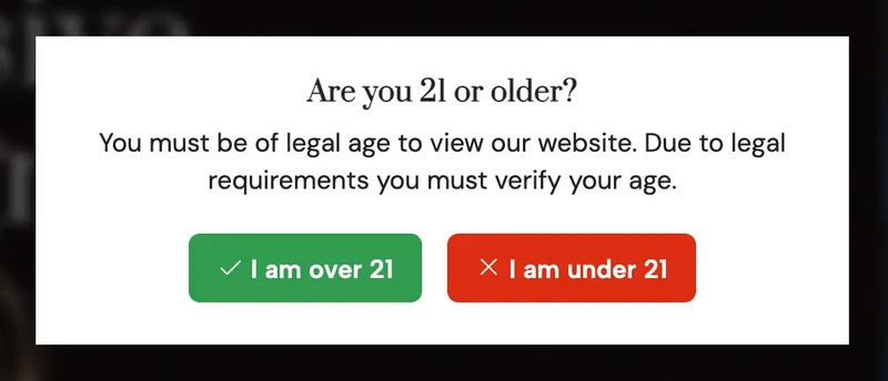
This section allows you to display a popup message that will be vertically and horizontally centered within the browser.
Even when its name relates to the usual age verification messages, you can eventually use it for anything you want.
By checking the Enable option, the following ones will become available for you to customize it.
Within this group you will find two options to add a Title and a Text, which will display at the start of the message.
This group provides options for you to customize the buttons of the message.
Accept button
Text for the button with which clients can accept.
Reject button
Text for the button with which clients can reject or decline.
Redirect link
Allows you to add a link for clients to be redirected once they click on the Reject button.
The following group provides color options for you to customize the message.
Accept button.Reject button.Note: The text color for the buttons will be automatically adjusted based on contrast.
This section allows you to customize certain settings regarding Articles (pages) within the theme.
Articles are the preview blocks that display the image and content of a page.
Note: we will refer as
Contentto the information such as Date, Title, Excerpt and Link/Button.
Within this group you will find options to customize the design and look of them within the theme.
Content order
Defines the order of the elements that display within the content area, which is the one that goes just below or after the article image.
Here you can reorder the options by dragging them up and down, to define the position that feels better for you.
Some things to consider are:
Information group that can be found further down.Show categories option within the Categories group that can be found further down.Show option within the Link group that can be found further down.Style
Defines the style for all Articles within the theme, based on the following options:
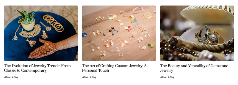
Classic: The content for all articles will stack vertically, one below the other and after the post image.

Minimalist: The content for all articles will be placed on top of the image. Also, an Overlay element will be displayed between the image and content to generate a contrast between both.
Show image
Defines if the image of articles should be displayed or not.
For the case of the Minimalist style, the color of the the background and elements will be determined based on the Color pack you choose within the Content colors option.
Space between
Allows to define if articles will have a space or gap between them.
The amount of space will be determined based on what you choose within Theme settings > Design > Theme styles > Spacing.
Note: This option won’t be visible if
Spacingit’s equal toNone.
Rounded corners
Allows to define if articles will have rounded corners or not. The way in which this is applied will vary based on:
Classic version it will be applied just on the image. Card style is enabled, it will apply to both the card and the image.Card style is enabled and Image padding is disabled, it will only apply to the card.Minimalist version it will be applied to the entire block, as well as to the Overlay element.Card style
By enabling this option all articles within the theme will be presented with a “card” or “box” style.
Also, the following options will become available:
Content colors
Allows to define a Color Pack for all the Articles within the theme.
This group of options allow you to customize the design of all article’s titles.
This group of options allows you to define the design and appearance of the titles for all Heading sections within the theme:
Size
Defines the size for all titles based on pre-defined calculations directly affected by the Font base size option located at Theme settings > Fonts > Sizes.
When choosing Custom, you will be able to manually adjust the size for desktop and mobile devices independently.
Weight
Defines the weight for all titles.
Note: The weight will depend on the available variables of the font that you have defined for the Main font option within
Theme settings > Fonts > Font selection.
Letter spacing
Allows to adjust the space between letters.
All caps
Allows to force all titles to be displayed in uppercase letters, even when they weren’t written like that: e.g. TITLE.
Date
Displays the date on which articles were created.
It will also show the Date format option, so you can define the one that’s best for you:
Excerpt
Displays a shorter version of the article’s content.
By enabling it, the Characters length option will become visible with which you can define the amount of characters the description will be limited to.
Show categories
By enabling the Show categories option, the list of page categories related to each article will be displayed.
The following options will become available to be used as well:
Display date on articles
It allows you to display the publication date for all articles before the title.
By enabling this option, the next one will become available:
Show as button
Displays the link of each article as a button within the content area of each article.
If disabled, the image and title will still be clickable for customers to go and read it.
The following options will become available as well:
External link
When clicking on an article, the link to their single page will be opened in a new browser tab.
This section allows you to customize the design and certain settings that are applied to the Shopping process pages: Cart, Checkout, Review and Success.
The options within this section will have an effect on all the process pages if you have selected Classic within Checkout > Checkout form.
For the case of the Standard version, the options here will only be applied to the Cart page.
This option allows you to choose a Color pack for the shopping process pages.
This group allows you to add a logo especifically for these pages through the Custom logo option. Which will override the one added on Settings > General > Branding, if one is uploaded there.
If no logo it’s uploaded, the Store name will be displayed.
Heights
You will find two options to adjust the height of any instance of a logo for desktop and mobile devices.
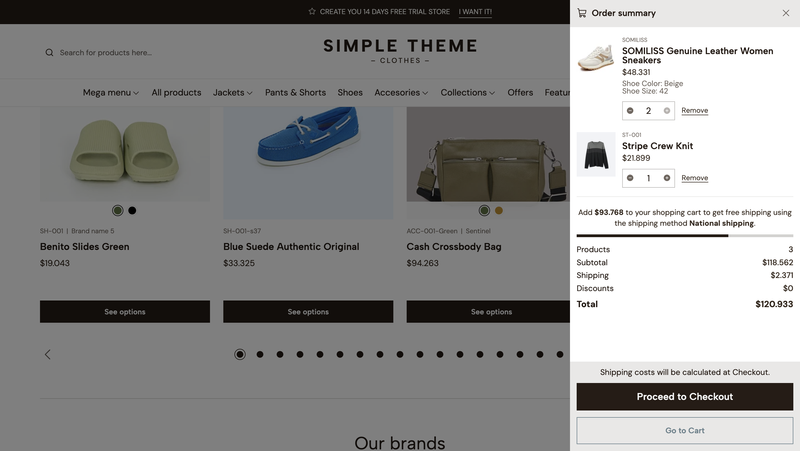
The Cart sidebar it’s a lateral panel that displays the summary of a customer’s order, which includes the following:
When enabling the Show sidebar option, the following ones will become available:
The options within this group allow you to define aspects of the final page of the shopping process.
Note: Will take effect only for the
Classiccheckout form version.
Show message
Adds an additional message below the main one that’s already displayed by default.
By enabling this option, the following ones will become available:
Main/Default within ***Settings > General > Locations***.***Settings > General > Emails***, at the end of that section.Product table at success page
Displays the list of products that a customer purchased, at the very end of the page.
Note: in some countries this is mandatory to be displayed by laws and regulations.
This section and its options allows you to add custom and/or external codes to the theme, so you don’t necessarily have to edit the code of it.
This is useful and most used for scripts or tools like:
Note: For installing, adding and/or using tools such as Google Analytics, Google Customer Reviews, Facebook pixel and TikTok pixel, Jumpseller already has the necessary fields within the store’s admin panel at
Settings > General > Preferences > Analytics Settings.
The available options are the following:
Top head code
It allows you to add an external code at the start opening <head> tag of the theme code.
Bottom head code
It allows you to add an external code at the end/closing <head> tag of the theme code.
Top body code
It allows you to add an external code at the start opening <body> tag of the theme code.
Bottom body code
It allows you to add an external code at the end/closing <body> tag of the theme code.
Note: these fields don’t support the use of
liquidtags. So if you need to use something like that, it will necessarily have to be done directly within the theme code through the Code Editor.
This section allows you to control the behavior of some features across the theme, which are related to shopping options for your customers.
Hides the prices for all products across the theme.
Note: If you don’t disable the next option, merchants could still be able to purchase products even when prices aren’t visible.
This option allows you disable all the shopping features across the theme, such as the following:
Message
When enabling the previous option, a message will be displayed on all store’s Product pages, which you will be able to customize with the options found below.
Note: The WhatsApp number connected to this button will be the one added in your store’s admin panel, within
Settings > General > Preferences > Social media. If no number is added there, this button won’t be displayed.
Within this section you will find several groups and fields that will allow you to translate texts within the theme.
This can go from texts in messages, to texts within buttons and links.
These are divided into groups, like for example the following:
Add to cart button and Buy now link.Start your free 7-day trial. No credit card required.