Theme Gallery Guide: Install, Edit, and Manage Themes
Manage your store's theme gallery: install new themes, apply or preview them, transfer customisations, and import or export themes between stores.
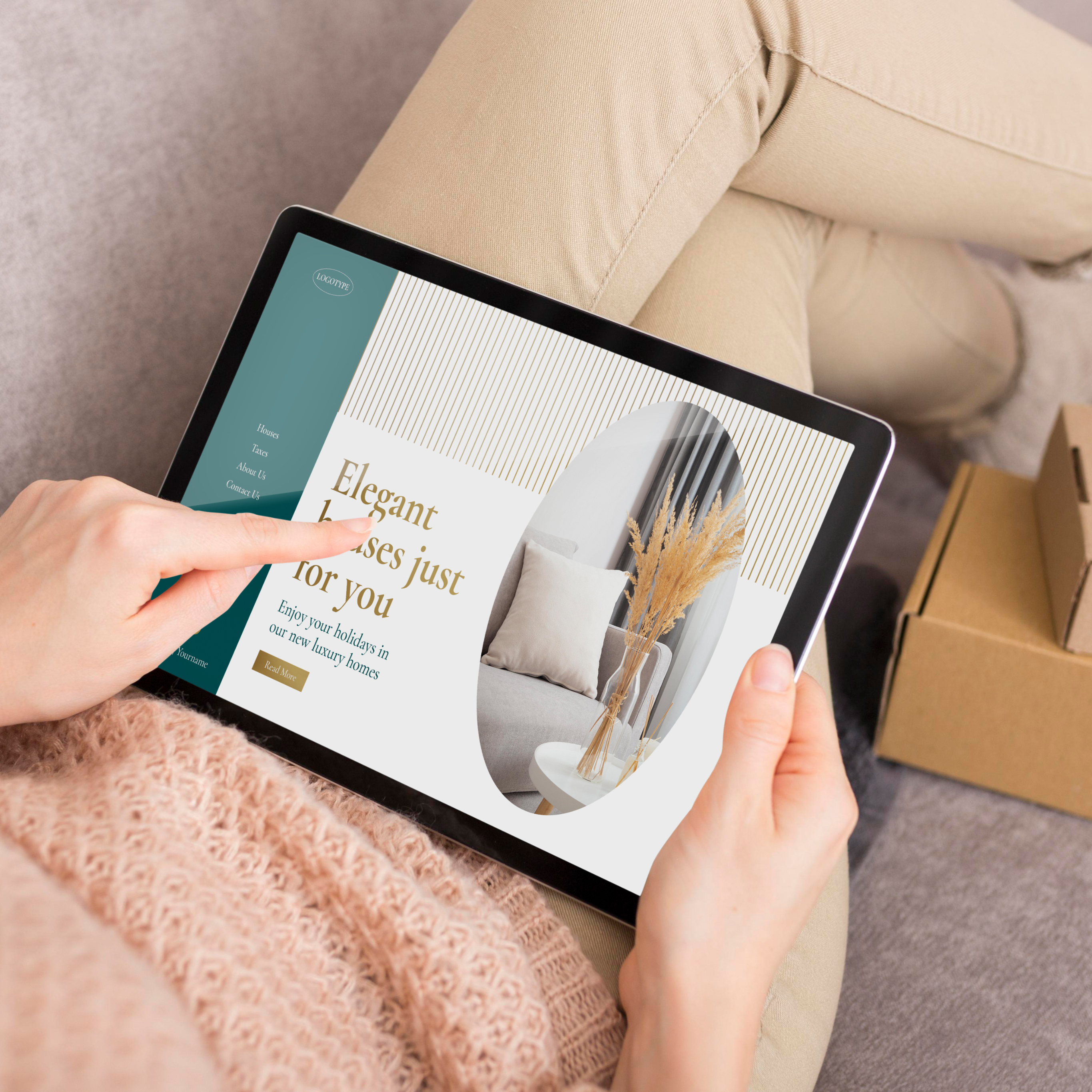
The purpose of this component is for you to highlight features or information about your store, with content that can go from things such as promotions, featured categories or products, among others you can think of.
By clicking on the component name you will find general options to customize it, which will determine how the section will look and behave, as well as its subcomponents (Banners). The available options for this component are the following:
Allows to define the maximum width that the component will stretch to the browser window.
You can read more about how this option will affect the component on this page.
Note: the size for the images that you can upload within each
Bannerwill vary depending on the option you chose here. These are explained in detail on this section of the page.
It allows to define the amount of banners that will be displayed within a single horizontal row, for desktop devices that have a width equal or greater than 768px.
Note: When choosing 4 columns, the amount of banners on smaller desktop devices will be automatically changed to 2 columns, to preserve a good visibility of the content inside them.
It allows to define the amount of Banners that will be displayed within a single horizontal row, for Mobile devices that have a width equal or lower than 767px.
This option allows you to define if there will be space between banners.
Note: it will only be visible and available to be used if what’s defined at the Spacing option in
Theme settings > Design > Theme stylesis any other thanNone.
Allows to define if the component content will be displayed within a section of type Carousel or Grid.
You can read more about the differences between these two types on this page.
This group of options will become visible when you choose Carousel, and they will allow you to customize its behavior.
You can find the full list of options on this page.
By enabling this option:
Banner, to manually customize aspects of them.The options that will be displayed in the main component panel will be the following:
Position option it’s equal to After the image.By enabling this, a Heading section will be displayed before the component’s content. You can find the list of options on this page.
This group contains the following options to customize the component:
The Customize options allows to adjust the animations for this specific component. You can read which ones are available on this page.
The subcomponent for a Banners component is called Banner, and you can add as many as you want. The options for this subcomponent are the following:
The following options will allow you to define the images for each banner and define how they will look and behave:
Note 1: Vertical and horizontal positioning is most noticeably visible when images are larger than the area of the slide, like for example if the are has a vertical dimension and the uploaded image has a rectangular dimension.
Note 2: Desktop will consider devices with a width equal or higher than 576px. As for Mobile, will be for devices with a width equal or lower than 575px.
Next, you will find several options for adding a Link to the banner:
In this group you will find several options for adding content to a banner, which will only be visible in the storefront if you have enabled the Banners content option, within the main component settings:
Position option at the main component settings it’s equal to After the image.Note: For alignment and positioning options, the Desktop measure will consider devices that have a width equal or higher than 576px; for Mobile will be for devices equal or less than 575px.
The suggested dimensions on the tables below will vary depending on the combination and variations of several options of the main component settings.
when you choose to enable Show Banners content, Numbers of columns on desktop and Numbers of columns on mobile options of the component settings:
When enabling this option the dimension for images will have a depend on what you chooseo within the following options:
Note: Consider that the following dimensions are suggestions from a minimum measure standpoint.
Desktop
| Ratio / Number of columns | 4 columns | 3 columns | 2 columns | 1 column |
|---|---|---|---|---|
| Landscape | 306 x 172 px | 416 x 234 px | 636 x 358 px | 1296 x 729 px |
| Portrait | 306 x 408 px | 416 x 555 px | 636 x 848 px | 1296 x 1728 px |
| Rectangular | 306 x 230 px | 416 x 312 px | 636 x 477 px | 1296 x 972 px |
| Square | 306 x 306 px | 416 x 416 px | 636 x 636 px | 1296 x 1296 px |
Mobile
| Ratio / Number of columns | 2 columns | 1 column |
|---|---|---|
| Landscape | 366 x 206 px | 527 x 297 px |
| Portrait | 366 x 488 px | 527 x 703 px |
| Rectangular | 366 x 275 px | 527 x 396 px |
| Square | 366 x 366 px | 527 x 527 px |
When disabling this option we are only specifying the minimum suggested Width, as the Height for each Banner will depend on the number of pixels of each image you upload, in combination with the Number of columns definitions for both desktop and mobile devices.
Desktop
| 4 columns | 3 columns | 2 columns | 1 column |
|---|---|---|---|
| 306 px | 416 px | 636 px | 1296 px |
| 306 px | 416 px | 636 px | 1296 px |
| 306 px | 416 px | 636 px | 1296 px |
| 306 px | 416 px | 636 px | 1296 px |
Mobile
| 2 columns | 1 column |
|---|---|
| 366 px | 527 px |
| 366 px | 527 px |
| 366 px | 527 px |
| 366 px | 527 px |
Start your free 7-day trial. No credit card required.