Guide on How to Customize Your Store with the Visual Theme Editor
Learn how to use the features of the visual theme editor and start modifying your theme faster! With live preview, you do not need to switch browse...
Starter is a theme packed with new features. It’s a flexible theme that’s suitable for all stores, allowing you to quickly set up a store and start selling.
Install Starter from Our Theme Gallery
Log in to your store and go to Themes > Gallery. Search for the Starter theme and install it.


After installation, you can click on Customize to open our Visual Editor and configure your theme.
In this section you can select and configure different options for your store.
Disable Shopping features
If enabled, all Shopping features will be hidden, like ‘Add to Cart’ buttons, the ‘Header Cart icon’, etc.
Disable Product Prices
If enabled, all product prices will be hidden so customers won’t be able to see them.
Enable Repeat Order (Customer Account)
Enables or disables the option for customers to repeat orders from their order’s history.
Button Style
Choose a Rectangular (default), Radius, or Circular shape.
Choose which style of button you would like to use in the store.
Products per Page (Category)
40 (default), 36, 24, 12
How many products will be displayed per page on category pages.
Products per Page (Search Results)
40 (default), 36, 24, 12
How many products will be displayed per page on the ‘Search results’ page.
In this section you can configure some options in the purchase process on the cart page. You can activate the breadcrumb, activate the number of steps or hide the country selector.
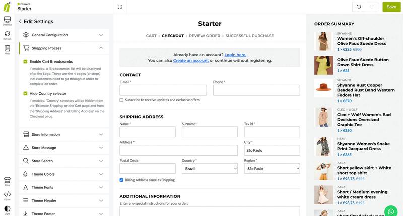
Enable Cart Breadcrumbs
If enabled, a ‘Breadcrumbs’ list will be displayed after the Logo. These are the 4 pages (or steps) that customers need to go through in order to complete an order.
Hide Country selector
If enabled, ‘Country’ selectors will be hidden from the ‘Estimate Shipping’ on the Cart page and from the ‘Shipping Address’ and ‘Billing Address’ on the Checkout page.

The following information will be shown in the Store Message
This option is used when you want to leave a maintenance page or while configuring the theme. It’s useful when you don’t want to make your store available in situations like a price or design update.

Enable Store Message
If enabled, displays a full-page section that blocks the store front-end preventing customers from shopping.
Background Color
The background color of the message.
Content Color
Color of the elements/content of the section, like Titles, Texts, Links, etc.
Content Color > Hover
Color of the links on hover transition (mouse over).
Enable Social Nets
Allows you to display the list of Social Networks (e.g. Instagram, Facebook) added to the store in ‘Settings > General > Social Media’.
Enable Contact Information
Allows you to display the list of Contact Information items (e.g. Email, Address) added to the store in ‘Themes > Visual Editor > Edit Settings > Store Information’.
Logo
Allows you to display a Logo in the message.
Title
Main Title of the section.
Example: “We are working on something special for you”
Text
Text that is shown below the title, to give more context about what the message is about.
Example: “We can’t wait for you to see it. Please check back soon”
You have the option to enable or disable this option, as well as customize the text in the search field.
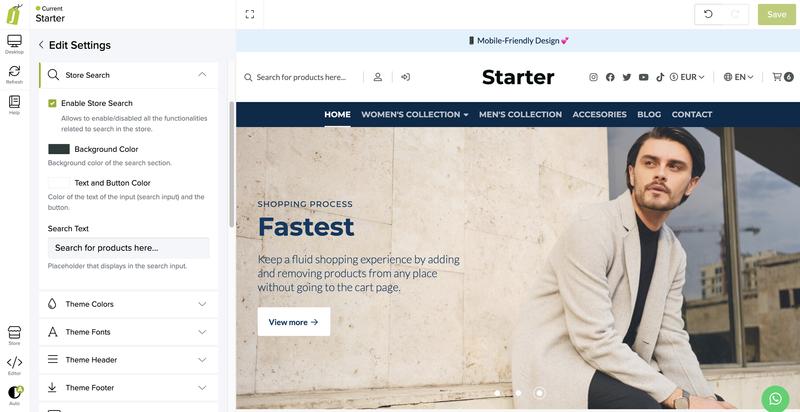
Enable Store Search
Allows you to enable/disabled all the functionalities related to search in the store.
Background Color
Background color of the search section.
Text and Button Color
Color of the text of the input (search input) and the button.
Search Text
Placeholder that is displayed in the search input.
Example: “Search for products here…”
Set your theme colors. You can customize the color of titles, texts, buttons, prices and discounts.

Main Color
Color used mostly in titles and certain elements of main relevance in the store.
Secondary Color
Color used mostly in subtitles, texts/descriptions and certain elements of secondary relevance in the store.
Tertiary Color
Color used in certain sections, details and elements of the store like backgrounds.
Default Button > Text Color
Color of the text of the ‘Default Button’.
Default Button > Background Color
Background color of the ‘Default Button’.
Default Button > Background Color (Hover)
Background color of the ‘Default Button’ on hover transition (mouse over).
Main Button > Text Color
Color of the text of the ‘Main Button’.
Main Button > Background Color
Background color of the ‘Main Button’.
Main Button > Background Color (Hover)
Background color of the ‘Main Button’ on hover transition (mouse over).
Secondary Button > Text Color
Color of the text of the ‘Secondary Button’.
Secondary Button > Background Color
Background color of the ‘Secondary Button’.
Secondary Button > Background Color (Hover)
Background color of the ‘Secondary Button’ on hover transition (mouse over).
Prices Color
Color used for all the elements that relate to a price in the store, except when it has a visible discount.
Discount Color
Color used for all the elements that relate to a discount in the store.
You can setup a font family set to save time in your theme configuration process.

Enable Font Set
If enabled, your store will use the predefined ‘Font Sets’, from which you can select what set to use.
Font Set (Google Fonts)
Choose which Font combination from Google Fonts (fonts.google.com) you would like to use in the store.
You can setup fonts individually if you don’t want to use the font set configuration.

Individual Font selection
If enabled, you can manually select the ‘Main’ and ‘Secondary’ fonts for your store.
Google Fonts - Main Font
Montserrat (default)
Choose which Font will be used as the ‘Main’ font for your store.
Google Fonts - Secondary Font
Roboto Sans (default)
Choose which Font will be used as the ‘Secondary’ font for your store.
Choose the version of the ‘Header’ you would like for your store. You can check how each version looks and works in the theme documentation. (Version 3 is the default)
Version 1

Version 2

Version 3

Header Versions
Header Width
Grid Width (default) - Browser Width: The width of the ‘Header’ takes 100% of the browser’s width; Grid Width: The width of the ‘Header’ aligns with the maximum width that the store’s grid has, which is about 1300px wide.
Header Fixed If enabled (suggested), ‘Header’ will be fixed at the very top of the browser and follow the user as they scroll through the store. If disabled, it will always stay at the top of the page.
Background color
Background color of the ‘Header’.
Texts color
Color of all the items available in the ‘Header’, like titles, texts, descriptions, links, etc.
Header Logo
Example: your_logo.svg or your_logo.png
Logo ideally in .svg format (vector). If not, we recommend that you upload it in .png format (with transparency).

Header Logo > Mobile version
Example: your_logo.png
Optional. Logo that is displayed in Mobile devices that has a width less than 575px. If not uploaded, ‘Header Logo’ will be displayed for all devices.
Enable Header Login item
Allows you to show or hide the ‘Login/Register’ icon that opens the Sidebar panel for Customers to Login or Register in your store.
Header Navbar > Background color
Background color for the ‘Navbar’ menu, which is only visible and available in Header ‘Version 3’.
Header Navbar > Content color
Color of the elements and content in the ‘Navbar’, like links, texts, arrows, etc.
Header Navbar > Enable Social Media links
If enabled, ‘Social Media’ links will be visible in the ‘Navbar’ menu on the right side of it, and therefore, after the menu items added in ‘Navigation > Main Menu’.

Footer Version
Choose the version of the Footer you would like for your store. Each version relates to the ones available at ‘Themes > Navigation’.
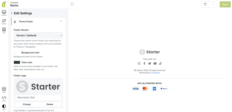
Version 1 (default)

Version 2

Version 3
Available Versions: Version 1 (default), Version 2 or Version 3
Background color
Background color of the ‘Footer’.
Texts color
Color of all the items available in the ‘Footer’, like titles, texts, descriptions, links, etc.
Footer Logo
Example: your_logo.png
Logo ideally in .svg format (vector). If not, we recommend that you upload it in .png format (with transparency).
Remove ‘Powered by Jumpseller’
Allows you to remove the ‘Powered by Jumpseller’ text that is displayed in the Footer of your store.
Menu Title 1
Title that will display along with the list of Footer Menu 1 items. Only available for Footer’s versions 2 and 3.
Menu Title 2
Title that will display along with the list of Footer Menu 2 items. Only available for Footer’s versions 2 and 3.
Enable Social Networks
Allows you to show/hide the list of Social Networks of the store in the Footer.
Social Networks Title
“Follow us” Title that will be displayed alongside the list of Social Networks.
Enable Contact Information
Allows you to show/hide the list of Contact Information details of the store in the ‘Footer’. Only available for Footer’s versions 2 and 3.
Contact Information Title
“Contact us” Title that will be displayed along with the list of Contact Information details.
Enable Newsletter (with Mailchimp) Allows you to show/hide the Newsletter section in the Footer. Only available for “footer version 3”. Visit this link to know how to configure this section.

To use the newsletter features you must create an account in Mailchimp and use the data from it.
Newsletter Title
“Join our Newsletter” Title that will be displayed in the Newsletter section of the Footer.
Newsletter Description
Description that appears after the title of the section.
Newsletter URL
Mandatory. URL of the ‘Mailchimp Form’ which subscribers will join.
Audience ID number
Mandatory. This is an alphanumeric code that needs to be included, in order to prevent bots/spam emails from subscribing to your Mailchimp account.
Newsletter Disclaimer
Text that is displayed below the Newsletter form. This is helpful to let customers know they accept terms before subscribing.
Newsletter Field - Text
Your email here
Text that is displayed in the field where customers will type their email.
Newsletter Field - Text Color
Color of the text that goes inside the input where customers will type their emails.
Newsletter Field - Background
Background color of the input where customers will type their emails.
Newsletter Button - Text
Subscribe
Text that is displayed in the button of the form.
Newsletter Button - Text Color
Color of the text of the button of the Newsletter form.
Newsletter Button - Background
Background color of the button of the Newsletter form.

If enabled, all payment methods you enable will be displayed in the Footer of your store.

Allows you to place any custom code you need at the end of the ‘<head>’ or ‘<body>’ tag of your store. This is useful for any plugins and/or tools you wish to install.
This sidebar is visible on mobile devices, and when you use version 2 of the header. You can configure colors, logo and information.

Sidebar Alignment
How elements of the sidebar will be aligned: left or centered.
Sidebar Menu Logo
You can upload a Logo that is displayed at the top of the Sidebar.
Enable Social Networks
Enable Social Networks icons below the main menu inside the Sidebar Menu.
Social Networks - Title
Title of the ‘Social Networks’ section.
Enable Secondary Menu
Enables the ‘Secondary Menu’ which is available to use in ‘Themes > Navigation > Secondary Menu’.
Secondary Menu - Title
Title of the ‘Secondary Menu’ section.
Enable Contact Information
Allows you to display the list of ‘Contact Information’ details available in ‘Themes > Visual Editor > Edit Settings > Store Information’ like email, phone, etc.
Contact Information - Title
Title of the ‘Contact Information’ section.
Sidebar Primary Color
Color of texts and links for sidebar navigation.
Sidebar Secondary Color
Color of border and backgrounds of active sub-items.
Sidebar Background Color
Background color for sidebar navigation.
Add a WhatsApp button to your home page and products for your customers to contact you.
Enable WhatsApp Button
Enables a WhatsApp button that follows users as they scroll through the store. We recommend not enabling this feature if you’re going to use a plugin or integration that will also display a button.

Enable on Product Page
Allows you to display a WhatsApp button in the message that will appear for products that have a status of ‘Not available’ or ‘Out of stock’. This button will be displayed below the ‘Contact us’ button, if enabled as well. In order for this button to work, you need to add your WhatsApp number in ‘Settings > General > Business Information > Social Media’.
WhatsApp Button position
Allows you to select the position of the WhatsApp Button, which will be in one of the corners of the store.
WhatsApp Button > Background color
Background color of the WhatsApp button.
WhatsApp Button > Background color (hover)
Background color for the WhatsApp button on hover status (mouse over).
WhatsApp Button > Icon color
Color of the icon (logo) for the WhatsApp button.
If your store uses more than one currency, or you want to show the value of your products in other currencies, you can activate this function. You must have an ‘Open Exchange Rates’ account for this to work.You must have created an ‘Open Exchange Rates’ account first in order for this to work. You can read more here

Enable Additional Currencies
Enables the feature to display different currencies in your store. Note: Customers will ultimately pay in the currency you have defined in ‘Settings > General’.
List of Additional Currencies
Allows you to add additional currencies for your store, like USD, EUR, etc. Add the 3 letter codes for each currency you want to display, separated by a comma (,).
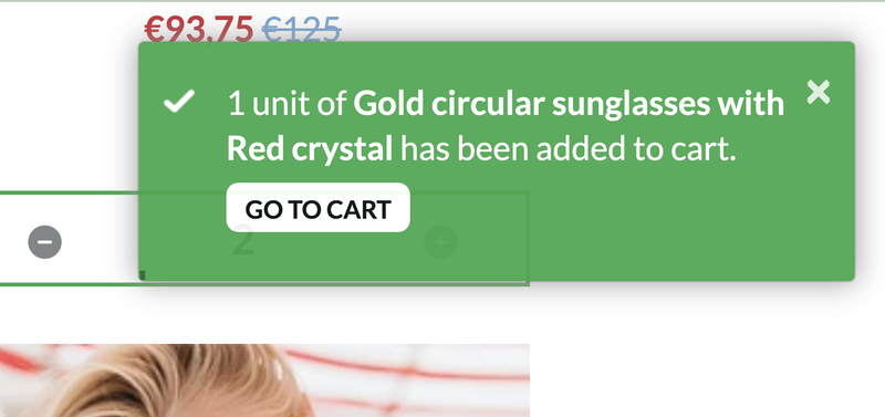
Enable Add to Cart Notifications
If enabled, a message will be displayed in the right side of the browser to notify customers that a product has been added to cart.
Notification Backgroud Color
Background color of notifications.
Notification Text Color
Color of the text for notifications.
Notification Position
Allows you to select if the notification will be displayed at the ‘top’ or ‘bottom’ of the browser, on the right side.
Add a bar with information or promotions at the beginning of your store. You can configure the amount of notices, bar color and text.

Enable in Shopping Process
Choose where the ‘Informative Slider’ will be displayed.
Enable Fixed Position
If enabled, the ‘Slider’ will be fixed at the top of the browser and before the Header, on desktop devices. If disabled, the ‘Slider’ will not be fixed and will be placed between the Header and the store’s content. This will be default and also work for Mobile devices.
Background color
Background color of the Slider.
Texts color
Color of the texts and links of the Slider.
Slides Order
1,2,3,4
Allows you to reorder the ‘Slides’ without the need to copy/paste information from one field to the other.
Slides speed
4 seconds (default)
Time that takes to pass from one ‘Slide’ to the next, in seconds.
Enable Slide 1
Slide 1 - Link Text
Text that will be displayed on the link.
Enable Slide 2
Slide 2 - Link Text
Text that will be displayed on the link.
Enable Slide 3
Slide 3 - Link Text
Text that will be displayed on the link.
Enable Slide 4
Slide 4 - Link Text
Text that will be displayed on the link.
Here you can configure options for Carrousels on the Category Page. If you have subcategories it will display more carousels.

Products limit
Limit the amount of products that carousels will display.
Enable Autoplay
If enabled, products will pass automatically from one to the next based on the speed defined in the option ‘Carousel speed’.
Carousel speed
Time that takes to pass from one ‘Product’ to the next, in seconds.
Enable Arrows
Displays ‘next’ and ‘previous’ arrows for customers to navigate between products.
Enable Dots
Displays navigational dots (points) for customers to navigate and choose products to see.
Here you can configure how your product blocks will be displayed across the store.


Here you can configure the breadcrumbs display option, as well as Product Information alignment, Show Product Brand, Brand in uppercase, Show Product SKU, Product SKU in uppercase, Show Product Stock, Colors, Contact button and more.
Add zoom to your product page and also define the zoom type, tooltip text, autoplay option, image corner style.


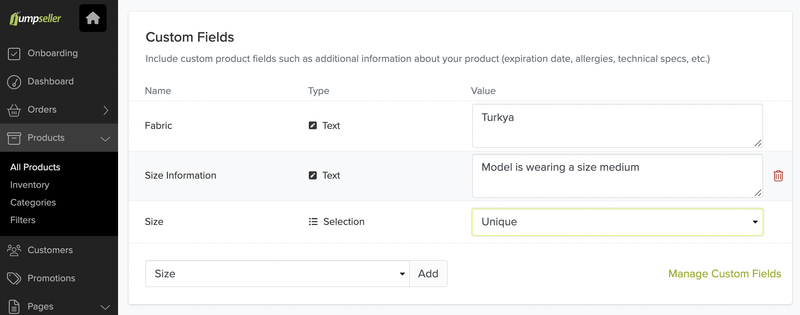
Remember to add your custom fields on the product page from your admin panel
Add relevant information about your products, including characteristics, shipping times or guarantees. This information can be displayed in a minimalist format.

Set up your contact page here. You can modify colors, add your address or your social networks. You can also display a map from Google Maps. This information comes from the general settings of the theme.

Here you can add or modify the text on the login or registration pages.

If you want to use the Blog component, you must configure the category of your articles here. Remember not to add categories to your content pages, for example about us, or terms and conditions. Only use the categories for content related to your blog.

Content Color
Color for the Subtitle, Title and Description of the ‘Slide’.
Button Text Color
Color of the text that is displayed inside the Button of the ‘Slide’.
Button Background Color
Background color of the button of the ‘Slide’.
Image (desktop) Alternative Text
Image for Desktop and Tablet devices with a minimum suggested width of 1600px and in .jpg format.
Image (mobile) Alternative Text
Image for Mobile devices with a maximum width of 575px and in .jpg format.
Content Alignment
Select Right, Center or Left
Position (or alignment) of the content of the ‘Slide’ (subtitle, title, description and button). For mobile devices the content will be center aligned by default.
Subtitle
Insert your subtitle text
Subtitle of the ‘Slide’. Only necessary if ‘Slider Type’ is ‘Image + Text’.
Title
Insert your title
Title of the ‘Slide’. Only necessary if ‘Slider Type’ is ‘Image + Text’.
Description
Description of the ‘Slide’.
Only necessary if ‘Slider Type’ is ‘Image + Text’.
Enable Link (button)
Displays a button that works as a link.
Link
Page to where customers will be redirected to when clicking. This can be a page, category or even a product.
Link Text
View More
Text that will be displayed inside the link (button). It should be brief, direct and attractive.
Enable Link Arrow
Displays a right arrow inside the link (button).
This component lets you display important information related with your store.
Configure how many ‘blocks’ will be shown in Desktop devices. For tablet devices it will always be 2 and for Mobile devices only 1.
You can change the margin, colors and icons.
Display your featured products on a grid or carousel. You can add a title, description and link to a category.
If you have a blog in your store, the blog component will help you display your content in a more attractive way. You can display your content through a grid, multiple carousels or a single carousel. You can configure the speed of your carousel or add a title, subtitle, description and link to your content. You can also change the margin, padding and colors.
The purpose of this component is to allow you to add videos from YouTube or Vimeo in a simple way. To do this you must use the embed code generated by these platforms. Make it more attractive by adding an image as a title and description, inviting viewers to take a look at your content.
We suggest you optimize images before uploading them. To do so, you can use tools such as https://tinypng.com or https://compressjpeg.com/.
Free trial for 14 days. No credit card required.